
No products in the cart.


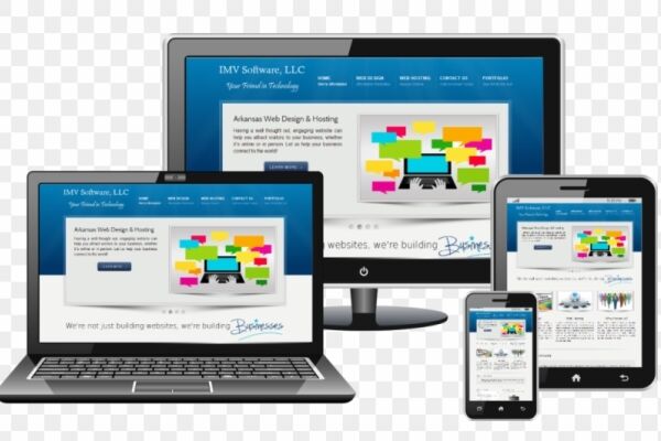
Certified Responsive Web Designer
₹6,500.00 ₹3,250.00
50% fee concession will end in
To train professionals in designing and developing responsive websites that deliver seamless user experiences across all screen sizes and devices.
Description
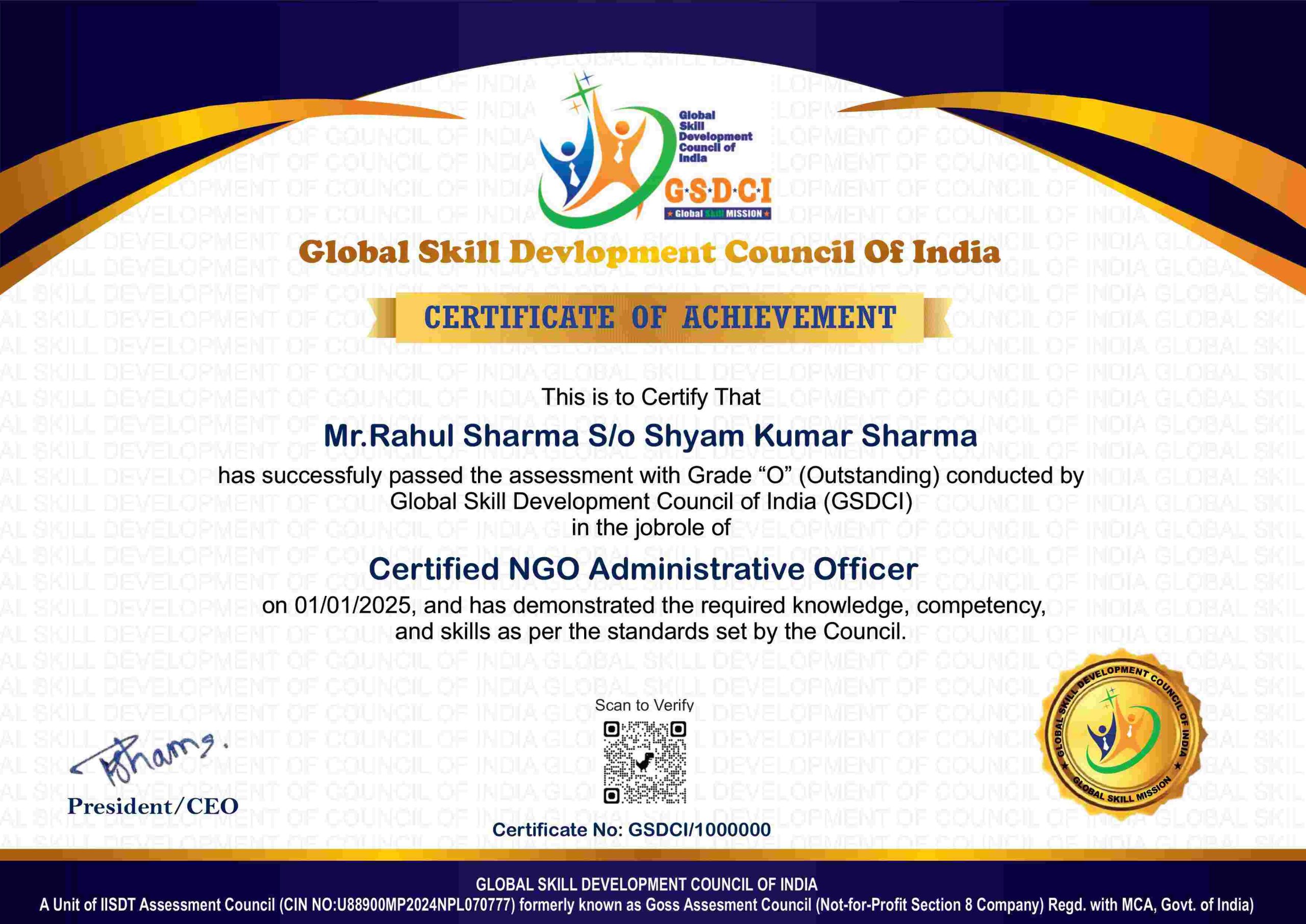
Certification Name: Certified Responsive Web Designer
Global Occupational Skill Standard – GOSS ID: GOSS/AD/CRWD/V1
Eligibility: 10+2 (higher Secondary) or Equivalent or minimum 2 years of relevant experience (experience-based learners can directly enroll and certify).
Objective: The Certified Responsive Web Designer course is designed to provide professionals with the skills needed to design and develop websites that adapt seamlessly to different screen sizes, devices, and orientations. The course covers responsive design principles, fluid grids, flexible images, and CSS media queries. Participants will learn HTML5, CSS3, and basic JavaScript for building mobile-first, cross-browser-compatible layouts.
Certification: Within 5 days after Completion of Online Assessment.
Get ready to join the Journey to become a GSDCI Certified Professional – International Certification and Assessment Body.
Steps to become a GSDCI Certified Professional:
Step 1: Select your certification you want to pursue.
Step 2: Click on get certified tab, new pop up window will open.
Step 3: Click on pay certification fee, you will be redirected to billing details page.
Step 4: Fill your details and click on pay certification fee, You will be redirected to payment gateway, pay fee by any available options like Card(Debit/Credit), Wallet, Paytm, Net banking, UPI and Google pay.
Step 5: You will get Login Credentials of Online E-Books and Online assessment link on your email id, within 48 hrs of payment.
Step 6: After completion of online assessment, you can download your Certificate Immediately.
Assessment Modules:
Module 1: Fundamentals of Responsive Web Design: Introduction to Responsive Design Principles and Philosophy, Differences Between Responsive, Adaptive, and Mobile-First Design, Understanding Viewport, Screen Sizes, and Breakpoints, Benefits of Responsive Design for User Experience and SEO, Role of a Responsive Web Designer in Modern Web Development, Overview of HTML5 and CSS3 in Responsive Design.
Module 2: Layout Techniques and Media Queries: Using Fluid Grids and Percentage-Based Layouts, Implementing Media Queries for Device-Based Styling, Creating Breakpoints for Mobile, Tablet, and Desktop Views, Responsive Containers, Wrappers, and Flex Layouts, Best Practices for Device Orientation and Pixel Density, CSS Units (em, rem, vw, vh, %) and When to Use Them.
Module 3: CSS Flexbox and Grid for Responsive Layouts: Understanding CSS Flexbox for 1D Layouts and Alignment, Building Responsive Navigation Bars with Flexbox, CSS Grid System for 2D Layouts and Complex Grids, Combining Grid and Flexbox for Advanced Responsive Designs, Responsive Reordering and Content Prioritization, Practical Layout Projects Using Modern CSS Techniques.
Module 4: Responsive Typography, Images, and Media: Fluid Typography Techniques Using CSS Clamp and Viewport Units, Managing Font Sizes and Line Heights Across Devices, Responsive Image Techniques (srcset, picture element), Optimizing Image Loading and Formats (WebP, SVG), Embedding and Scaling Responsive Videos and iFrames, Accessibility Considerations for Scalable Content.
Module 5: Responsive Frameworks and Tools: Overview of Frontend Frameworks (Bootstrap, Tailwind CSS, Foundation), Using Grid Systems and Utility Classes in Frameworks, Customizing Framework Components for Branding, Browser DevTools for Responsive Testing and Debugging, Mobile-First Design Workflow with Figma or Adobe XD, Code Editors and Responsive Design Plugins.
Module 6: Testing, Deployment, and Best Practices: Cross-Browser and Cross-Device Compatibility Testing, Responsive Testing Tools and Emulators, Mobile Performance Optimization and Lazy Loading, Hosting and Publishing Responsive Sites, Maintaining and Updating Responsive Layouts, Building a Portfolio and Career Path in Responsive Web Design.
GSDCI Online Assessment Detail:
- Duration- 60 minutes.
- Number of Questions- 30.
- Number of Questions from each module: 5.
- Language: English.
- Exam Type: Multiple Choice Questions.
- Maximum Marks- 100, Passing Marks- 50%.
- There is no negative marking in any module.
| Marking System: | |||
| S.No. | No. of Questions | Marks Each Question | Total Marks |
| 1 | 10 | 5 | 50 |
| 2 | 5 | 4 | 20 |
| 3 | 5 | 3 | 15 |
| 4 | 5 | 2 | 10 |
| 5 | 5 | 1 | 5 |
| 30 | 100 | ||
| How Students will be Graded: | |||
| S.No. | Marks | Grade | |
| 1 | 91-100 | O (Outstanding) | |
| 2 | 81-90 | A+ (Excellent) | |
| 3 | 71-80 | A (Very Good) | |
| 4 | 61-70 | B (Good) | |
| 5 | 50-60 | P (Pass) | |
| 6 | 0-49 | F (Fail) | |
Benefits of Certification:
🌍 1. Global Recognition & Credibility – Stand out worldwide with a certification that opens doors across borders. Trusted by employers, respected by institutions, and recognized in over 100 countries.
📜 2. Quality Assurance through ISO Certification – Certified to global ISO standards, our programs deliver excellence, consistency, and a benchmarked learning experience that speaks for itself.
💼 3. Career Advancement & Employability – Enhances your resume and increases chances of promotions or job offers.
🤝 4. Non-Profit Trust Factor – Certifications from non-profit organizations are mission-driven rather than profit-driven.
📚 5. Access to Verified Learning & Resources – Often includes e-books, mock tests, and online support without hidden costs.
🔍 6. Transparency & Online Verification – Certifications come with a unique Enrolment ID for easy online verification by employers and institutions.
⏳ 7. Lifetime or Long-Term Validity – Certifications usually have lifetime validity or long-term recognition, reducing the need for frequent renewals.